
The Franco Analytics suite
Twelve decision tools across media planning, measurement, customer value and allocation — each a self-contained, transparent model you can drive, not a black box you rent.
Pick a solution from the bar above, or a card below. Each opens a one-page brief — what it is, the problem it solves, how it’s different, and what you get in your hands.
Plain-English guidance — less black box, more useful decisions.
Self-contained models you keep and drive, not software you rent.
Methods you can see and defend to a finance team.
Find the right one
Light And Fast
A lean, fast marketing mix model and optimiser — the quickest honest read on what your media is doing and where the budget should go.
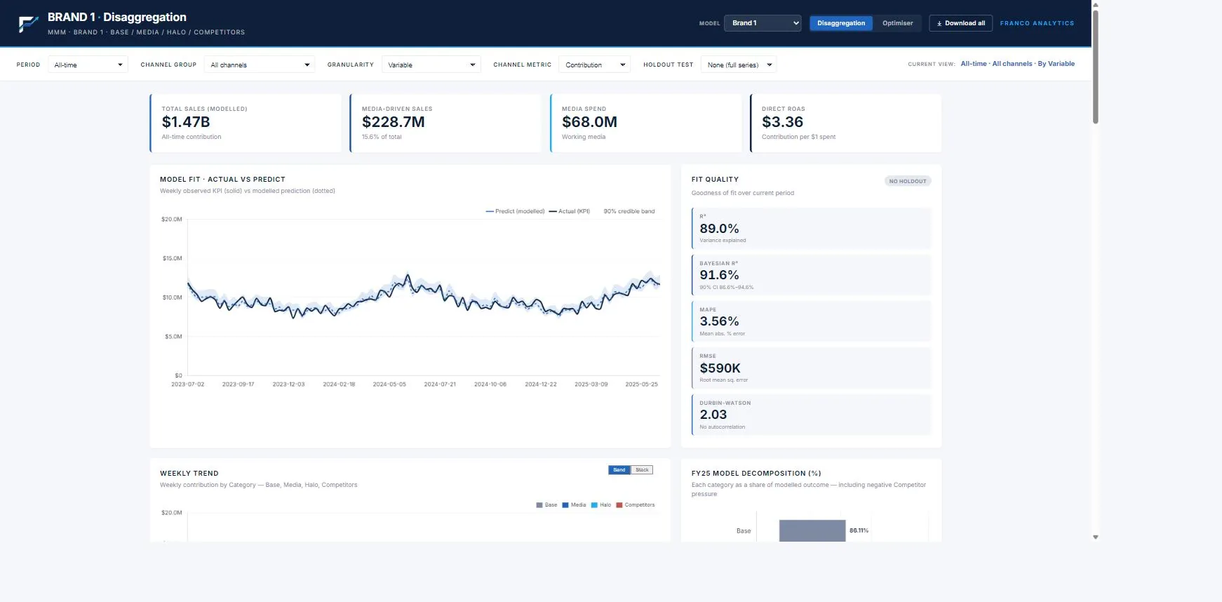
A lean, entry-level marketing mix model, delivered as one interactive dashboard. It splits sales into base, media, competitor pressure and an unexplained remainder, and pairs that read with a budget optimiser — built fast on the data you already hold.
The fast, honest read on what your media is doing — and where the budget should go
Two questions sit behind most media decisions: what is my advertising actually driving, and where should the next dollar go? Light & Fast answers both. It separates real media contribution from base sales and competitor pressure, ranks every channel by return, and the optimiser shows the spend split that earns the most — and the point where each channel stops paying its way. Lean by design: it goes straight at the media question, without the long build or heavy data demands of a full operational model.
Most ways into MMM ask for a big commitment before you see value. This one doesn’t.
- Open-source frameworks (Google Meridian, Meta Robyn) are free but code-only — a data-science hire and weeks of build before you see anything.
- Enterprise consultancies (Nielsen, Analytic Partners) run into six figures and months, and hand back a slide deck.
- SaaS platforms (Recast, Sellforte and similar) mean a login, a subscription and a model to tune yourself.
Light & Fast is a done-for-you media model delivered as an interactive tool — built quickly on the data you already have, with the budget optimiser included. Transparent, not a black box: model fit and validation are shown in the tool, not hidden.
You get a working model and an optimiser in days, and a tool you keep.
An interactive dashboard you can drive — built fast, kept simple
Disaggregation view
Model fit, and a clean split of sales into base, media, competitor pressure and the unexplained remainder — so media is read on its own merits.
Channel performance
Every sub-channel ranked by ROAS, spend versus contribution, the channel-group split and the quarterly trend.
Optimiser
Saturation curves and four economic points per channel; optimise any budget within ±10–50% bands, or find break-even.
Scenario planning (what-if)
Drag a slider to move spend; contribution and ROAS update live. Compare current versus scenario side by side.
And the rest — One self-contained file — no login, works in any browser. Export any chart or table to CSV or image. A walkthrough of the findings and a refreshed build when new data lands, included — plus a clear path to a fuller model when you need pricing, distribution and the wider picture separated out.
Balanced Broad
A marketing mix model and budget optimiser, built on your data and handed to you as a tool you can drive.
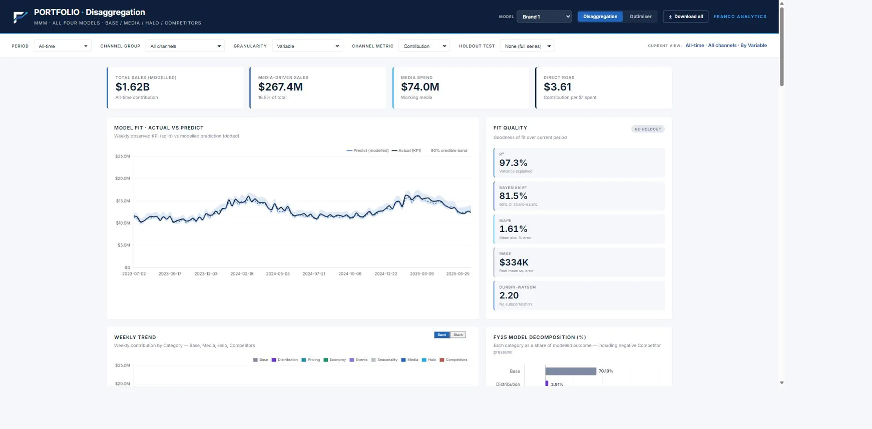
A full marketing mix model and budget optimiser in a single interactive dashboard. It decomposes sales across ten drivers — base, media, pricing, distribution, the economy, competitors, holidays and supply — and turns the read into a defensible spend plan, with the methodology documented.
Know what your marketing actually drives — and where the next dollar should go
Every platform claims the same sales. Blended ROAS looks healthy while revenue stays flat, and cookies tell you less each year. The model cuts through it: it separates the real contribution of each channel from base sales, pricing, distribution, the economy, competitor pressure, holidays and supply — so your media is judged on its own merits, not the noise around it.
Most vendors give you a model you can’t touch, or a tool you have to build. This gives you both.
- Open-source frameworks (Google Meridian, Meta Robyn) are free but code-only — they need a data-science hire, weeks of build and ongoing upkeep, with no interface.
- Enterprise consultancies (Nielsen, Analytic Partners, Kantar) run into six and seven figures, refresh slowly, and leave you a slide deck to interpret — the insight rarely reaches action.
- SaaS platforms (Recast, Sellforte and similar) hand you a login and a learning curve, and expect you to tune the model yourself.
Franco does the modelling for you and delivers it as an interactive dashboard — not a deck, not code, not a seat to learn. It’s transparent, not a black box: the full methodology is documented, with R² of 95.4% and holdout validation built in. No data-science hire, no per-seat licence, no consultancy retainer.
You get the rigour of a custom model and a tool you can actually run.
An interactive dashboard, plus the support to keep it sharp
Disaggregation view
What actually drove sales — model fit, and every dollar split across base, media, pricing, distribution, the economy, competitors, holidays and supply.
Optimiser view
What to do next — saturation curves per channel, four economic points, and a one-click optimal split for any budget.
Scenario planning (what-if)
Drag a slider to move spend; contribution and ROAS update live. Compare current vs scenario side by side, or find each channel’s break-even.
Yours to keep
One self-contained file — no login, no seat to learn. Export any chart or table to image, CSV or Excel. Technical methodology document included.
And the rest — The partnership behind it: a walkthrough of the findings, quarterly refits as new data lands, and ongoing support to pressure-test scenarios before you commit budget.
Balanced Broad Pricing
A marketing mix model that treats price the way it treats media — an investment with a return — so you can optimise across both.
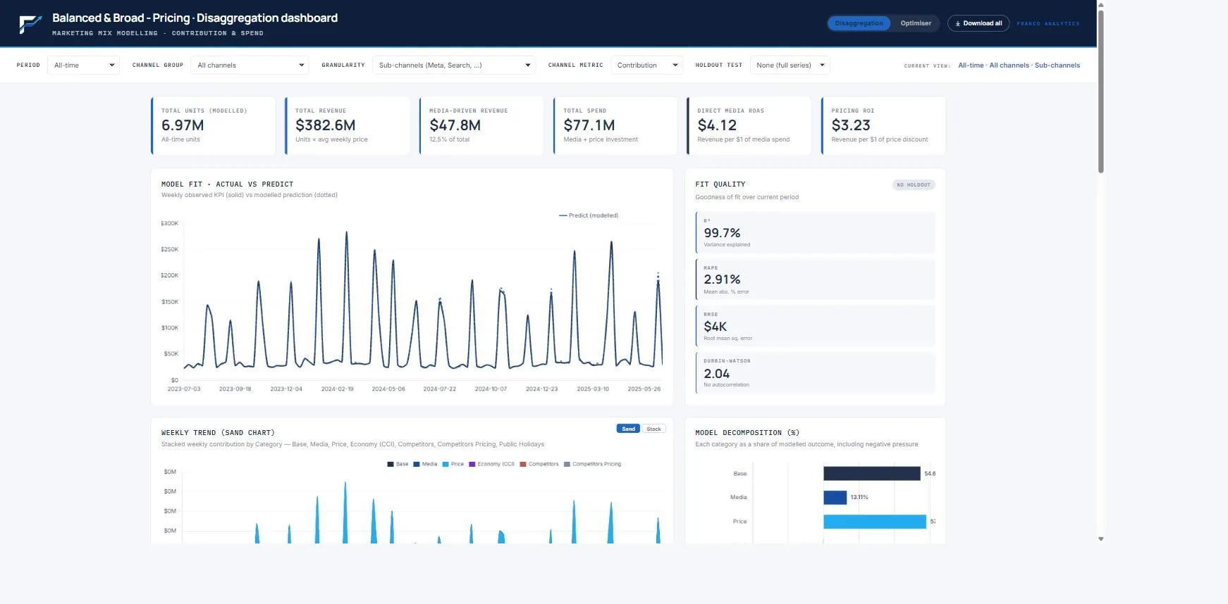
A marketing mix model that brings price in as a first-class lever beside media. It separates your own discounting and competitors’ pricing as their own contribution streams, reports a Pricing ROI next to media ROAS, and optimises across media and price together.
See what your discounting really earns — and balance it against media
Most measurement nets price out as a nuisance variable, so promotions get judged on volume, not return. This model brings pricing in as an investment lever. It separates the contribution of your own price discounting from base sales, media, the economy and public holidays — and from competitors’ pricing — and reports a Pricing ROI, the revenue earned per dollar of discount, right alongside media ROAS. With both on the same footing, you can finally ask whether the next dollar is better spent on media or given away at the till.
Most MMM treats price as weather. This one treats it as a lever you control.
- Open-source frameworks (Google Meridian, Meta Robyn) treat price as a control to net out — code-only, and a data-science hire to run.
- Enterprise consultancies (Nielsen, Analytic Partners) can model price, but at six figures, slowly, and handed back as a slide deck.
- SaaS platforms (Recast, Sellforte and similar) are mostly media-only and report media ROAS; pricing isn’t a first-class lever.
This model puts media and price on the same canvas. Your own price effect and competitors’ pricing are separate, named streams; discounting carries a Pricing ROI you can read against media ROAS; and the optimiser allocates across media and pricing together, not just within the media mix. Delivered as a tool you hold, not a deck.
Few tools let you weigh a dollar of media against a dollar of discount — this one does.
An interactive dashboard that reads media and price side by side
Pricing-aware disaggregation
Sales split into base, media, your own price, competitors’ pricing, the economy and public holidays — discounting read on its own.
Pricing ROI, beside media ROAS
Revenue earned per dollar of discount, shown next to media ROAS; sub-channel ranking, spend versus contribution and quarterly trend.
Media vs Pricing optimiser
Switch the optimiser to allocate between total media and pricing; saturation curves, four economic points, ±10–50% bands and break-even.
Scenario planning (what-if)
Drag a slider to move spend; contribution and ROAS update live. Compare current versus scenario side by side.
And the rest — One self-contained file — no login, works in any browser. Export any chart or table to CSV or image. A walkthrough of the findings and a refreshed build when new data lands, included — with a clear path to a fuller model when you need the full operational and external picture, or the brand funnel, separated out.
Total Control Tower
A full-funnel, multi-market marketing mix model and optimiser, built on your data and handed to you as a command centre you can drive.
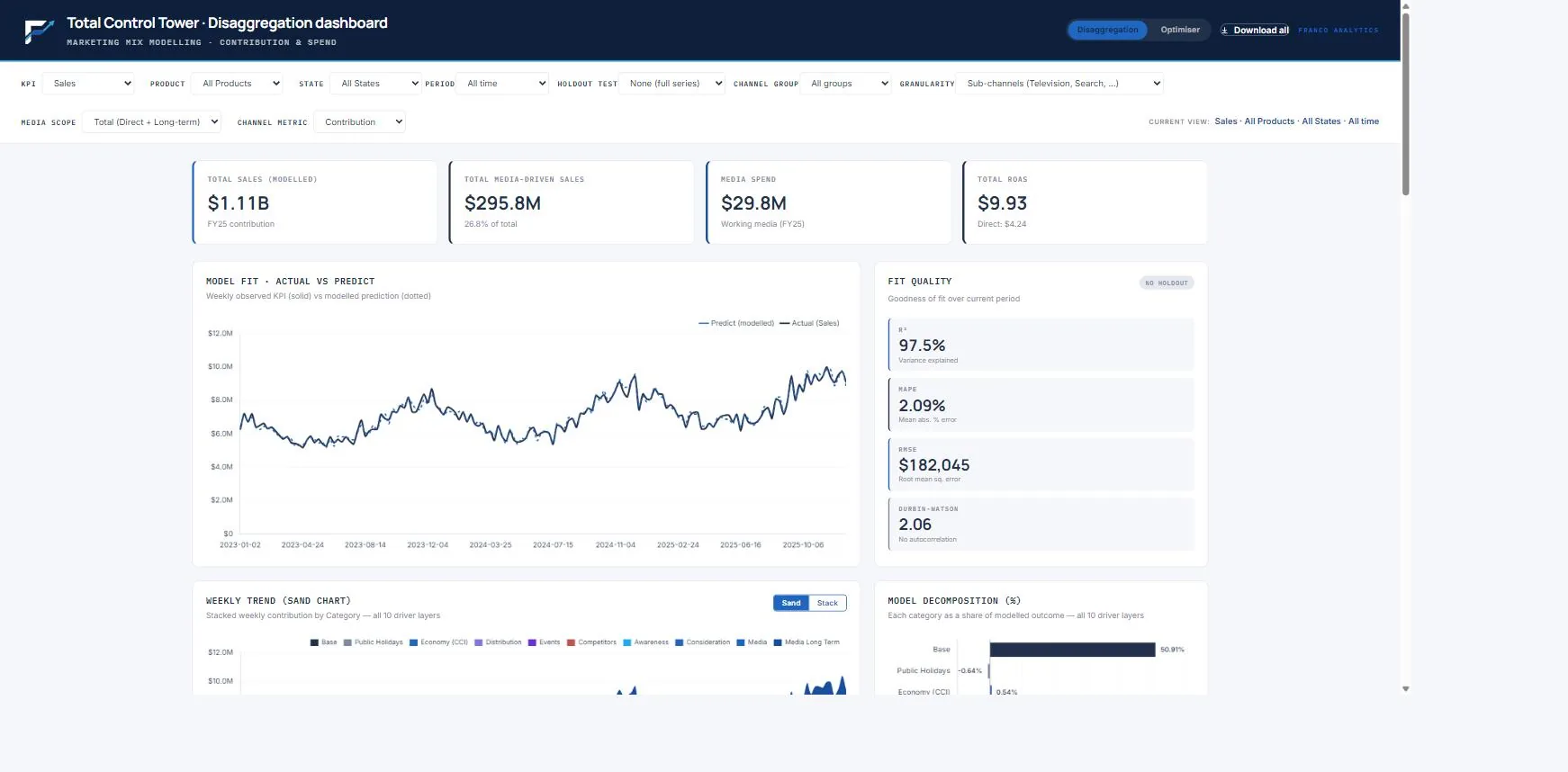
Franco’s flagship marketing mix model — a full-funnel, multi-market command centre. It models three KPIs (Sales, Awareness, Consideration) with funnel halos, splits contribution by product and market, separates long-term brand effect from short-term response, and optimises both the channel mix and the quarter-by-quarter phasing.
See the whole funnel, every market — and decide where the next dollar works hardest
Most measurement judges media on the last click and the national average. That writes off brand-building that hasn’t converted yet, and hides a channel winning in one state while it bleeds in another. Total Control Tower reads the full funnel — how media builds Awareness and Consideration, and how those feed Sales — and separates long-term brand effect from short-term response. It does it by product line and by state, so you see what is really happening, not the blended picture.
The depth of a six-figure consultancy engagement — delivered as a tool you can drive.
- Open-source frameworks (Google Meridian, Meta Robyn) model a single KPI, are code-only, and need a data-science hire to build and keep running.
- Enterprise consultancies (Nielsen, Analytic Partners, Kantar) can model the funnel, but at six and seven figures, refreshed slowly, and handed back as a slide deck.
- SaaS platforms (Recast, Sellforte and similar) mostly track one KPI on national data and report direct ROAS — a login and a learning curve.
Total Control Tower models three KPIs with funnel halos, splits contribution by product and state, separates long-term from short-term media, and optimises both the channel mix and the quarterly phasing — in one command centre. Transparent, not a black box: full methodology, with R² of 97.5% on Sales.
You get consultancy-grade depth and a tool you actually run.
A full-funnel command centre, plus the support to keep it sharp
Full-funnel disaggregation
Model fit and a 10-layer decomposition for Sales, Awareness and Consideration — every dollar and every point attributed, halo and long-term effects included.
Product & state breakdowns
Contribution split by product line and by Australian state, so national averages stop hiding the market-by-market detail.
Optimiser with real-world limits
Saturation curves and four economic points per channel; optimise any budget within ±10–50% deviation bands, or find break-even.
Quarterly Split
The optimal phasing of an annual budget across the four quarters — four response curves, not a flat seasonal scale.
And the rest — Filter by KPI, product, state, channel group and period (FY23–FY25, quarter or year); scenario sliders update contribution and ROAS live; export any chart or table to image, CSV or Excel. Methodology document, a walkthrough of the findings, quarterly refits and ongoing support all included.
Incrementality Testing
Design and pressure-test a geo-holdout experiment before you spend a dollar of holdout budget — and read the lift, the interval and the iROAS when it runs.
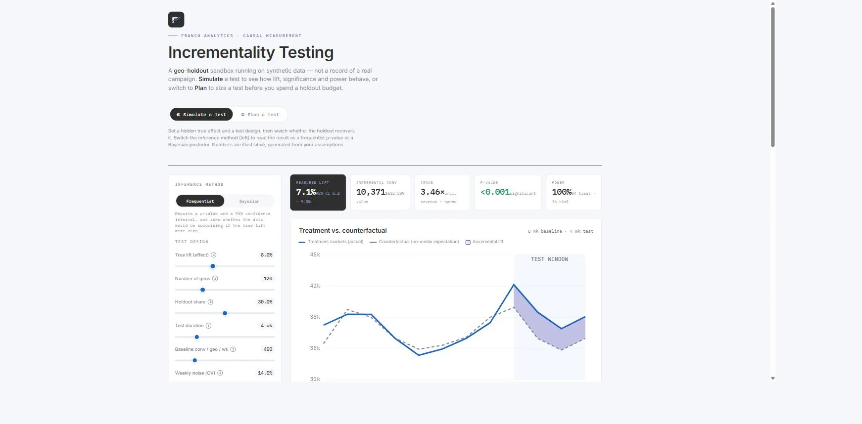
A geo-holdout experiment simulator and planner. It sizes a lift test before you spend — how many markets, how long, how big a holdout — in both frequentist and Bayesian modes, then reads incremental lift, its interval and iROAS when the test runs.
Prove what your media really caused — and make sure the test can prove it before you run it
Platform-reported ROAS counts conversions the ads may not have caused. The clean read is a geo-holdout: keep some markets dark, run media in the rest, and measure the gap against what would have happened anyway. The catch is that an underpowered test comes back inconclusive — weeks gone and holdout revenue given up for nothing. This tool sizes the test first: how many markets, how long, and how big a holdout you need to detect the lift that would actually change a decision, at the confidence you want. Then it reads the result — incremental lift, its interval, and iROAS, the true revenue per dollar of spend.
Most tools sell you the test. This one makes sure it’s worth running first.
- Open-source geo-lift (Meta GeoLift, Google CausalImpact) is the gold-standard method, but R-only — you need an analytics team to design and run it.
- Managed / always-on services (Haus, Measured, INCRMNTAL) run tests for you, but as a subscription, with the design inside their black box.
- Platform lift tools (Meta, Google) are quick and free, but single-channel and need outside validation.
This is a self-contained sandbox and planner. Simulate a test to see how lift, significance and power behave; switch to Plan to size markets, duration and holdout against a target effect and power before you commit. It does both frequentist and Bayesian — and the Bayesian mode can fold in a prior from a previous test or your MMM, so a smaller test can still conclude. Every input is explained in plain language, and a built-in note shows exactly how the numbers are computed.
You de-risk the design before the holdout budget is spent.
A simulator and a test planner — in one file
Simulate mode
Inject a known lift into synthetic markets and watch how the estimate, significance and power respond — the safest way to build intuition before a real test.
Plan mode (power & MDE)
Size the test — markets, duration, holdout — to detect your minimum effect at 80–90% power, with the smallest detectable effect at each market count.
Frequentist & Bayesian
Read the lift either way; the Bayesian mode pulls toward a prior from a past test or your MMM, so a smaller test can still reach a confident answer.
The decision numbers
Treatment versus counterfactual, incremental lift with its interval, and iROAS — incremental revenue per dollar of spend, the finance number.
And the rest — One self-contained file — no login, no R, works in any browser, with a built-in walkthrough of how the numbers are computed and what you need to run it for a real client. The planning sandbox is yours to keep; we build the real test plan on your market data.
Bayesian MMM Priors
A Bayesian MMM is only as good as its priors. See where every number comes from — and why grounding priors in your own experiments beats generic defaults.
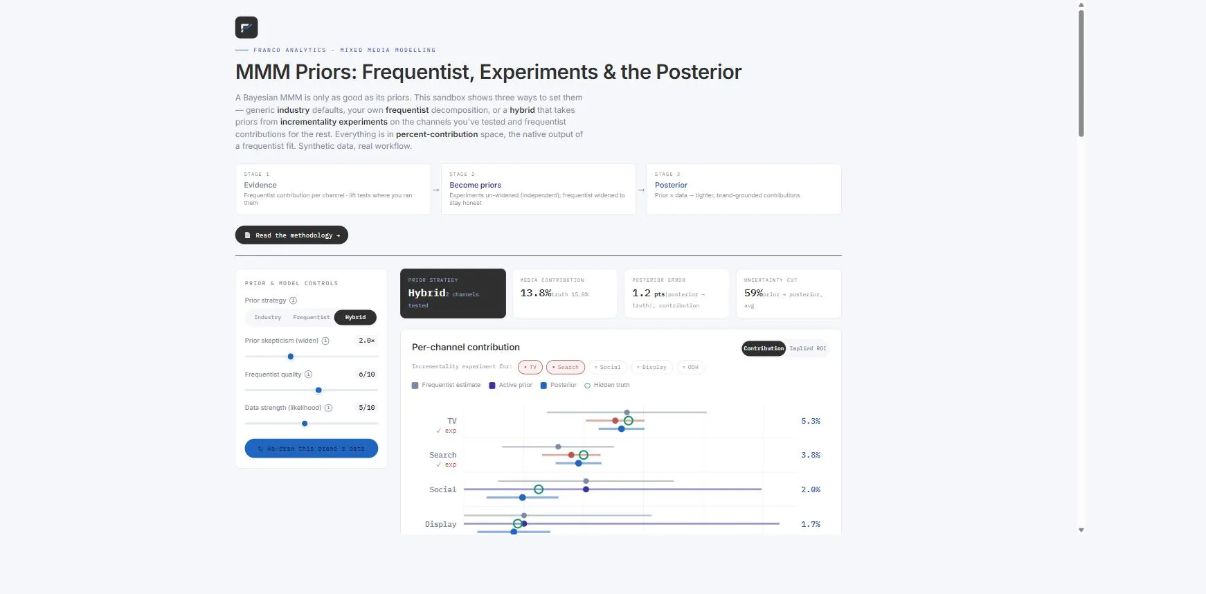
The methodology and transparency layer beneath a Bayesian MMM. It shows three ways to set priors — industry defaults, your own frequentist read, or a hybrid grounded in incrementality experiments — makes the prior × data → posterior update visible, and scores each approach against a known truth.
Make your MMM defensible — by grounding every number in evidence, not vendor defaults
A Bayesian MMM is only as good as its priors — the beliefs the model starts from before it sees your data. Most tools set those from generic industry defaults, hidden from view, so a model can be confidently wrong and no one can say why. This sandbox shows three ways to set priors — industry defaults, your own frequentist decomposition, or a hybrid that takes priors from incrementality experiments where you have run them and frequentist contributions for the rest — and proves, against a known truth, that the hybrid lands closest. It makes the Bayesian update visible: prior × data → a tighter, brand-grounded contribution for every channel.
The priors are where an MMM quietly goes right or wrong. Franco makes them the part you can see.
- Open-source MMM (Google Meridian, Meta Robyn) ship with default priors that aren’t always visible to the team using them — and they materially affect the result.
- SaaS MMM (Recast, Sellforte) set the priors for you, inside the platform; you take the calibration on trust.
- Consultancies (Nielsen, Analytic Partners) bake in their own assumptions — you get the output, not the dials.
Franco makes the priors explicit and grounds them in evidence: your own frequentist decomposition for every channel, and incrementality-experiment results for the channels you have tested — the hybrid, and the recommended setup. The sandbox shows prior × likelihood → posterior for every channel, and scores all three strategies against a hidden truth.
Experiment-grounded priors win — and you can see exactly why.
The working behind every contribution — in one file
Three prior strategies, compared
Industry defaults, your own frequentist decomposition, or the hybrid (experiments where tested, frequentist for the rest) — switch between them and watch the contributions move.
Prior × likelihood → posterior
The Bayesian update made visible for every channel — frequentist estimate, active prior, posterior and the hidden truth, with the response curve and marginal ROI.
The thesis, scored
Posterior error against a known truth for all three strategies — a like-for-like demonstration that experiment-grounded priors win.
The evidence checklist
Exactly what the evidence stage needs from you — weekly target and spend, controls, external signal, and lift-test results to turn into priors.
And the rest — One self-contained file — no login, works in any browser, with a plain-language note on how the update works and how we set the priors in your Bayesian MMM. This is the transparency layer over Franco’s MMM — it shows the working behind every number a finance team will question.
Digital Attribution
Eleven attribution lenses on the same touchpoint data — from last click to Markov, Shapley and a validated ensemble — with a causal calibration layer and a budget optimiser that shows what each view would do to your money.
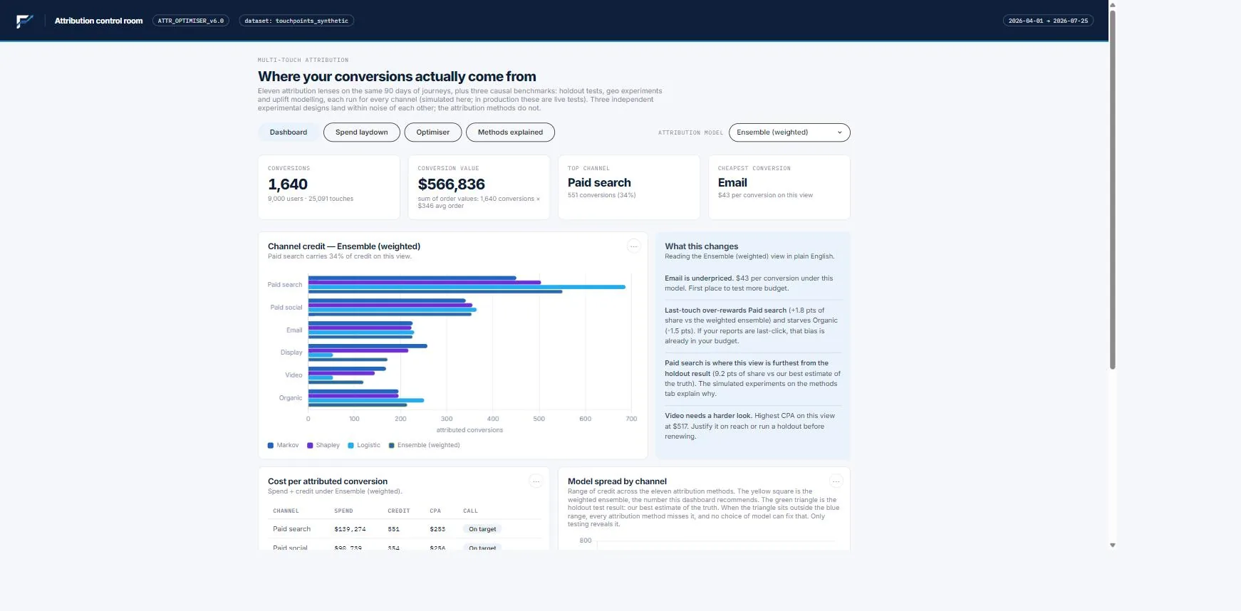
A multi-touch attribution control room. Feed it touchpoint journeys and spend, and it scores every channel under eleven attribution methods, blends the data-driven ones by how well each ranks real converting journeys, then turns the credit into CPA, ROAS, spend laydown and saturation response curves — all switchable from a single model dropdown.
Every attribution method tells a different story — and your budget follows whichever one you happened to pick
Last click over-rewards the channel that closes and starves the ones that created the demand. Path-based models credit presence, not consequence — a channel that shows up everywhere can earn double its real contribution. Most teams never see this, because their tool shows one method and presents it as the answer. This tool shows all eleven side by side, quantifies where they disagree, and marks the experiment result as the best estimate of the truth — so the size of the method risk is visible before money moves on it.
Most tools sell you one model’s answer. This one shows you the argument.
- Platform attribution (GA4 data-driven, Meta) is free but a single black-box lens — and the platform is grading its own homework.
- Attribution SaaS (Northbeam, Triple Whale, Rockerbox) runs one proprietary model on a subscription, with the methodology inside the box.
- One-off consulting studies deliver a Markov or Shapley read as a deck — a snapshot you can’t re-run next month.
This is a self-contained control room. Heuristics, Markov removal effect, exact Shapley, logistic regression and two ensembles — the weighted one blends methods by holdout AUC, predictive skill on journeys the models never saw. A model-spread chart shows the disagreement per channel, experiment results sit in the same dropdown as benchmarks, and the optimiser re-anchors to whichever lens you select, so you can watch the recommendation change with the method.
You see how much of the answer is method, not data — before the budget moves.
Four tabs, one dropdown, every number defensible
Eleven methods, one dropdown
Last click to Shapley to the AUC-weighted ensemble. Credit, CPA table and plain-English guidance all re-read from whichever model you select.
The causal layer
Holdout, geo and uplift results as benchmark entries, an attribution-versus-experiment chart, and a methods tab that explains every technique in plain English.
Spend laydown & ROAS
Weekly flighting against conversions, share of spend versus share of credit, and channel calls — scale it, hold, over-invested — with the thresholds shown.
Budget optimiser
Response curves anchored on each model’s read, per-channel constraints, break-even finder and a full allocation table with the projected gain.
And the rest — One self-contained file — no login, works in any browser, with CSV and PNG export on every chart and a source-protected build for publishing. The demo runs on synthetic journeys; we rebuild it on your touchpoint export, and your real lift tests slot straight into the causal layer.
Franco Index
Run your brand portfolio the way an investment committee runs its holdings — across budget, pricing and risk.
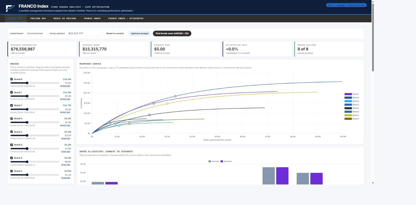
A brand-portfolio optimisation suite that applies investment-portfolio theory — efficient frontier, beta, volatility, risk tolerance and rebalancing — to a portfolio of brands, paired with saturation-curve optimisation for media and pricing. Five linked views in one tool.
Allocate across your brand portfolio with the discipline of an investment fund
Marketing teams diversify across brands by instinct — with no quantitative sense of what diversified means, where the risk sits, or which brand earns its weight. The Franco Index treats every brand the way an investment committee treats a holding: it measures each brand’s reward, its volatility and its beta — its sensitivity to the rest of the portfolio — from the actual sales history, and finds the allocation that earns the most for the level of risk you are willing to carry. Alongside it, saturation-curve optimisers answer the operational question of where the next dollar of media or pricing spend should go.
It sits where marketing tools and portfolio tools don’t meet.
- Media and MMM tools (Meridian, Robyn, Recast, Sellforte) optimise channels inside one brand — they treat each brand alone and ignore risk and correlation.
- Investment portfolio tools (Portfolio Visualizer, Koyfin, FactSet) bring the efficient frontier, beta and rebalancing — but only to stocks and funds, with no notion of saturation or spend.
- Consultancies will build a bespoke model — at six figures, slowly, and handed back as a slide deck.
The Franco Index brings investment-grade portfolio theory — efficient frontier, beta, volatility, risk tolerance and rebalancing — to your brand portfolio, and pairs it with saturation-curve optimisation for media and pricing. Two methods, five linked views, one tool. Reconciled to your own workbook to four decimals, so any allocation can be defended on its arithmetic.
Nobody else puts portfolio risk and marketing return in the same view — we are the only ones able to offer this solution.
Five linked views — budget, pricing and portfolio risk — in one file
Media ROAS & Pricing ROI
Per-brand saturation curves; the spend split that earns the most across brands — within ±10–50% limits, or at break-even.
Media vs Pricing
The strategic split between media investment and promotional pricing, before drilling into per-brand allocation.
Franco Index — risk & reward
Every brand mapped on the efficient frontier by reward and volatility; optimised vs current, a risk-tolerance dial, and a match-current-risk rebalance.
Franco Index — Attributes
The same optimiser on an editable attribute matrix (share, beta, reward…) — which brand profile to back, with a live heatmap.
And the rest — One self-contained file — no login, no server, mobile to desktop. Edit any input or include and exclude brands and the optimisation updates live; export any chart or table to CSV or PNG. Methodology document, a walkthrough of the findings, and a refreshed build within minutes when new data lands — all included.
Demand Forecaster Planner
Forecast demand, plan the promo calendar, and see what each discount really earns — across your whole brand family, before you commit a dollar.
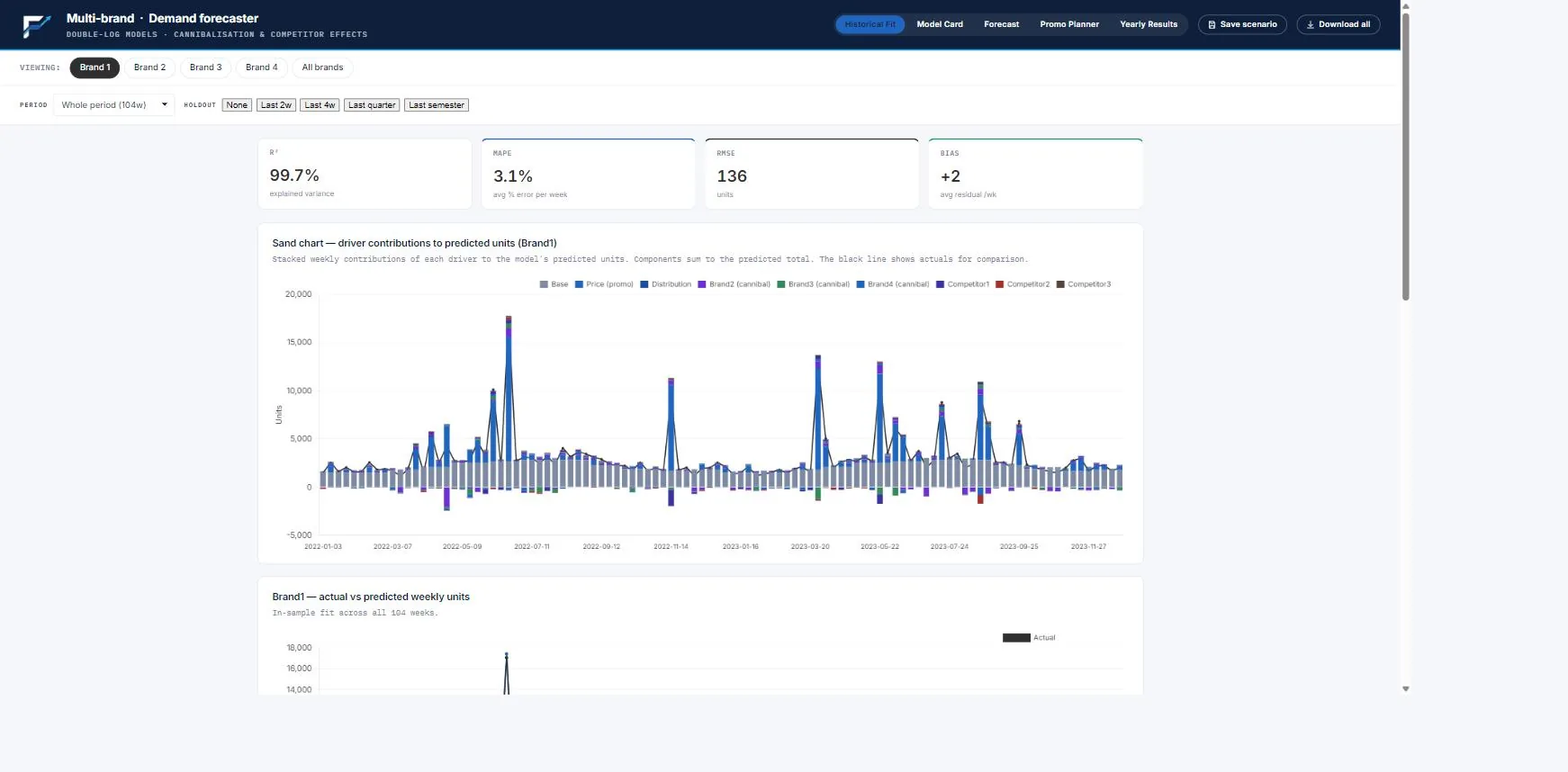
A demand-forecasting and promotional-planning tool for a portfolio of brands. It models price elasticity, seasonality, competitor pricing and cross-brand cannibalisation, forecasts units and revenue, and optimises a promotional calendar — all in one self-contained file with a built-in Model Card.
Know what every promotion will earn — and what it steals from your other brands
Promotions get planned on gut and last year’s calendar, and the bill arrives later: discounts that shifted volume you would have sold anyway, or stole it from the brand on the next shelf. This tool forecasts demand brand by brand from price elasticity, seasonality, competitor pricing and the cross-brand pull between your own labels. It shows the units and revenue each discount week will produce, the Promo Yield — revenue earned per dollar of discount — and the spillover onto sibling brands. Then it re-times the calendar to get more volume from the same discount budget.
Most promo tools are a year-long enterprise programme, or a black box. This is a planner you drive.
- Enterprise TPM/TPO suites (SAP, Oracle, Anaplan) are powerful, but 3–18-month builds wired into the supply chain, at six and seven figures.
- AI price/promo platforms (RELEX, Competera, Peak) are granular and real-time, but a subscription, an integration and a recommendation you take on trust.
- Spreadsheets and gut are fast and free, but blind to elasticity, seasonality and cannibalisation across the portfolio.
This is a self-contained planner built on your data — forecast, calendar, optimiser and yearly outcome in one file. It is portfolio-aware: cannibalisation across your brand family is modelled and shown, not hidden. And it is transparent: a built-in Model Card lays out every coefficient, elasticity, diagnostic and caveat, so a result can be checked, not just trusted.
You see the cannibalisation and the yield in plain sight — and you keep the tool.
Forecast, planner, model card and yearly outcome — in one file
Demand forecast & historical fit
Weekly units forecast per brand and for the portfolio, base versus promotional lift, with actual-vs-predicted fit and a driver decomposition.
Promo Planner
Edit price or discount per week; units, revenue and Promo Yield recompute live. Optimise schedule re-times your discounts to the highest-response weeks — same depths, more volume.
Cross-brand & competitor effects
Per-brand elasticity by discount band, cannibalisation between sibling brands, competitor substitution, and the discount-sweep curve from 0–55%.
Model Card & yearly results
Every coefficient, elasticity, VIF and caveat in plain sight; plus year volume, revenue, quarterly contribution and saved scenarios.
And the rest — One self-contained file — no login, no server, works in any browser. Export any chart or table to CSV or image. A walkthrough of the findings, and a refreshed build within minutes when new data lands — all included.
Customer Lifetime Value Banking
Model what a banking customer is really worth — risk-adjusted profit, not deposits — then see what you can afford to pay to acquire them and where the media budget should go.
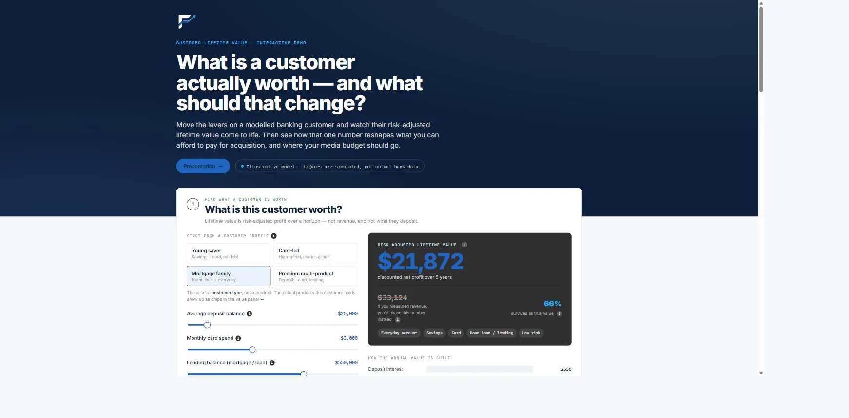
A customer-lifetime-value simulator for banking. It models a customer’s risk-adjusted profit over a horizon — deposit and lending spreads and card take, net of cost-to-serve and credit loss — and turns it into what you can afford to pay to acquire them.
Acquire for what a customer is worth — not for the cheapest conversion
A banking customer’s value isn’t what they deposit — it’s risk-adjusted profit over a horizon: deposit and lending spreads and card take, minus cost to serve and expected credit loss, discounted and weighted for how long they stay. Get that number and acquisition stops being a race to the lowest cost-per-conversion. This simulator builds CLV from the levers that actually drive it — balances, spreads, retention, credit-risk band — turns it into the ceiling on what you can afford to pay (the 3:1 CLV:CAC rule), and shows the same budget spent two ways: chasing the cheapest conversions, or the best CLV:CAC.
Most CLV tools hand you a score. This one hands you the acquisition decision.
- Predictive-CLV platforms / CDPs (Pecan, Retina) score every customer inside a platform you integrate and subscribe to — the number lands in a profile; the decision is still yours.
- Spreadsheet LTV (value × frequency × lifespan) is crude — not risk-adjusted, and blind to churn and credit risk.
- Consultancy models are a bespoke study, delivered slowly and handed back as a deck.
This is a self-contained simulator. Move the levers on a modelled customer and watch risk-adjusted CLV — and the CAC you can afford — move with it. It runs on the standard, defensible methods (BG/NBD and Gamma-Gamma for card and payment behaviour, survival models for deposits and lending), and it closes the loop to media: same budget, cheapest conversions versus best CLV:CAC.
It connects the value of a customer straight to what you should pay for one.
A value simulator that sets your acquisition ceiling — in one file
Risk-adjusted CLV, live
Move balances, spreads, retention and credit-risk band; watch lifetime profit — not deposits — recompute over your chosen horizon and discount rate.
What you can afford to pay
The CAC ceiling from CLV and the 3:1 benchmark — so acquisition targets are set by customer value, not by whatever the platform charges.
Same budget, two ways
A side-by-side of chasing the cheapest conversions versus the best CLV:CAC — the case for buying value over volume.
The method & the data
BG/NBD and Gamma-Gamma for card and payment behaviour, survival models for deposits and lending — in plain English, with the data a live version needs.
And the rest — One self-contained file — no login, works in any browser, with a plain-English glossary and the data checklist for a live build on your customers. It is the value layer beneath your acquisition spend — the worth of a customer, feeding what you can pay to win one.
Customer Lifetime Value Retail
Model what a shopper is really worth — margin over a horizon, not gross sales — then see what you can afford to pay to acquire them and where the media budget should go.
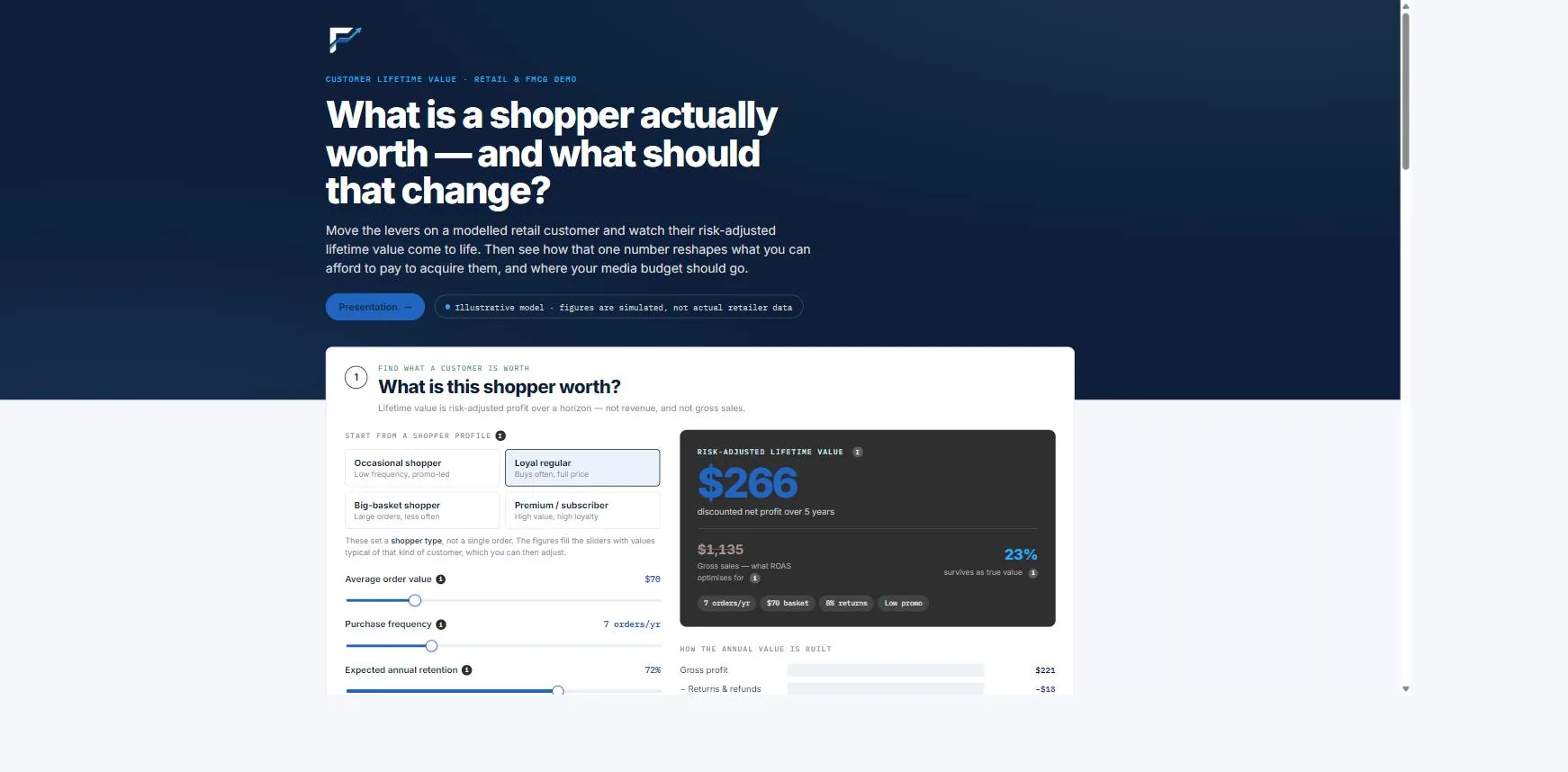
A customer-lifetime-value simulator for retail. It models a shopper’s margin over a horizon — order value and frequency at gross margin, net of returns, promo reliance and fees — and turns it into the ceiling on acquisition cost.
Acquire for what a customer is worth — not for the cheapest conversion
A shopper’s value isn’t gross sales — it’s margin over a horizon: order value and frequency at your gross margin, minus returns, promo reliance, fulfilment and payment fees, discounted and weighted for how likely they are to keep buying. Get that number and acquisition stops being a race to the lowest cost-per-purchase. This simulator builds CLV from the levers that actually drive it — order value, frequency, retention, return rate, margin — turns it into the ceiling on what you can afford to pay (the 3:1 CLV:CAC rule), and shows the same budget spent two ways: chasing the cheapest conversions, or the best CLV:CAC.
Most CLV tools hand you a score. This one hands you the acquisition decision.
- Predictive-CLV platforms / CDPs (Pecan, Retina) score every customer inside a platform you integrate and subscribe to — the number lands in a profile; the decision is still yours.
- Spreadsheet LTV (value × frequency × lifespan) is crude — not risk-adjusted, and blind to churn and credit risk.
- Consultancy models are a bespoke study, delivered slowly and handed back as a deck.
This is a self-contained simulator. Move the levers on a modelled shopper and watch margin-based CLV — and the CAC you can afford — move with it. It runs on the standard, defensible methods (BG/NBD and Gamma-Gamma, the retail workhorse for repeat buying, and survival models for subscriptions), and it closes the loop to media: same budget, cheapest conversions versus best CLV:CAC.
It connects the value of a customer straight to what you should pay for one.
A value simulator that sets your acquisition ceiling — in one file
Margin-based CLV, live
Move order value, frequency, retention, return rate and margin; watch lifetime margin — not gross sales — recompute over your chosen horizon and discount rate.
What you can afford to pay
The CAC ceiling from CLV and the 3:1 benchmark — so acquisition targets are set by customer value, not by whatever the platform charges.
Same budget, two ways
A side-by-side of chasing the cheapest conversions versus the best CLV:CAC — the case for buying value over volume.
The method & the data
BG/NBD and Gamma-Gamma (the retail workhorse) for repeat buying, survival models for subscriptions — in plain English, with the data a live version needs.
And the rest — One self-contained file — no login, works in any browser, with a plain-English glossary and the data checklist for a live build on your customers. It is the value layer beneath your acquisition spend — the worth of a customer, feeding what you can pay to win one.
Deduplication Of Reach
Estimate true net reach across channels from the inputs you already hold — no single-source panel required.
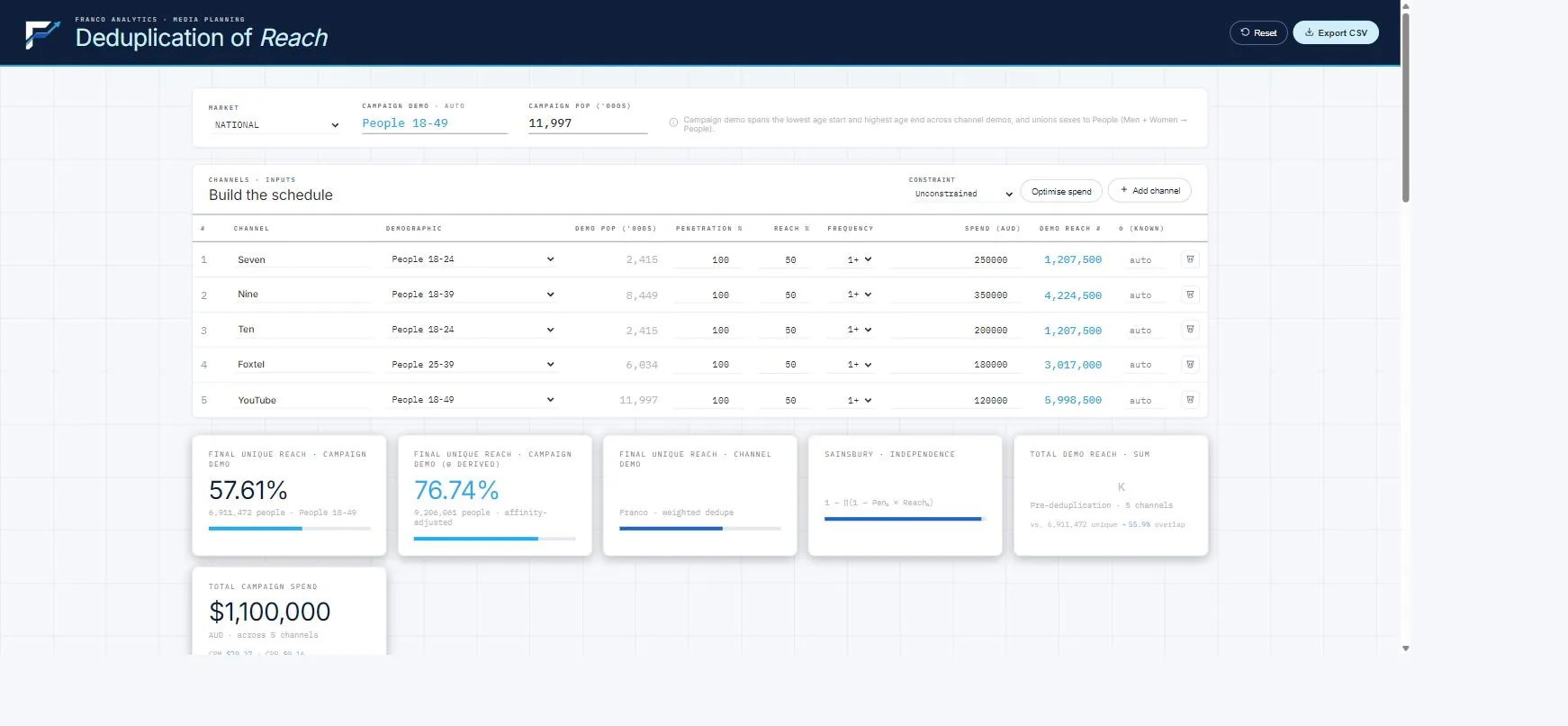
A media-planning tool that estimates net (unduplicated) reach across channels from the inputs you already hold — no single-source panel required. It reports a Sainsbury baseline, a conservative reach-weighted estimate and a θ-derived refinement, with a spend optimiser, and is grounded in a published methodology.
Know how many distinct people your schedule reaches — not the double-counted sum
Single-channel reach figures cannot be added: the same person is reached on more than one channel, and the duplicated audience has to be removed to get net reach. The data that reveals real overlap — single-source panels — is rarely available or affordable at the planning stage. This tool estimates net reach from the inputs a planner already holds — penetration, channel reach, demographic population — using a documented method, and reports three figures side by side: the Sainsbury independence ceiling, a deliberately conservative reach-weighted estimate, and a demographically grounded θ-derived refinement. A Hofmans curve and a marginal allocator then point to where the next dollar buys the most fresh reach.
The big systems sell you a panel to deduplicate. This computes it from what you already have.
- Currency & panel systems (Nielsen, Comscore, VideoAmp) deduplicate with a proprietary single-source panel — powerful, but enterprise-priced, tied to their markets, and a black box you trust.
- Agency planning suites (Telmar, Kantar) are workflow tools that still depend on licensed audience data and bury the overlap maths.
- Naive sum or plain Sainsbury is free, but either double-counts wildly or assumes channels never correlate.
This is a transparent, data-light estimator grounded in the century-long Sainsbury literature and set out in a Franco methodology paper. It needs no overlap data beyond the per-channel inputs you already hold, and it makes the overlap assumption visible — the θ index — rather than hiding it. Feed it a measured duplication where you have one and it gets sharper; give it nothing and it stays honestly conservative.
Net reach you can compute today and defend on its method — not a number you rent.
A net-reach planner with the overlap assumption in plain sight — in one file
Three net-reach figures, side by side
The Sainsbury independence ceiling, the conservative reach-weighted estimate, and the θ-derived demographic refinement — their spread shows how much the answer depends on overlap.
Campaign-demographic harmonisation
Channels bought on different age targets are placed on one common population, so reach percentages are finally comparable and add up coherently.
Spend optimiser
A Hofmans reach-versus-spend curve per channel and a marginal allocator that shifts budget, within your limits, to the channel adding the most fresh reach.
The planning metrics
CPM, cost per reach point, average frequency and incremental reach per channel — all from the same inputs as the reach estimate.
And the rest — One self-contained file — no login, works in any browser; export any card to CSV or image. Enter a measured duplication (θ) per channel where you have one. Backed by the published method, so any number can be defended on its derivation.